Visual Balance
The Brief
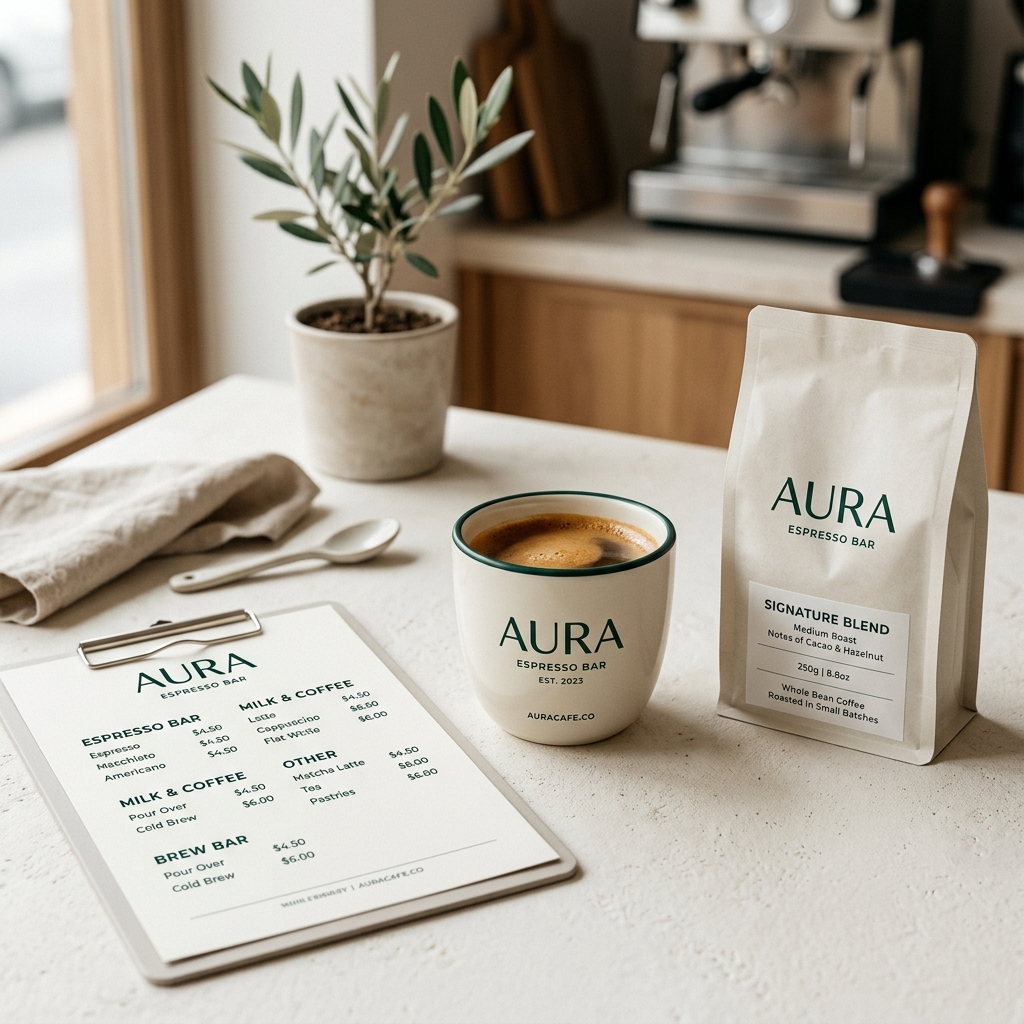
Establish a premium visual identity system, custom typography, logotype, and menu architecture for Aura Espresso Bar, a specialty coffee brand.
The Scrutiny
To evoke the tactile, sensory craft of brewing coffee, we structured the branding layout around the root-2 rectangle proportion. We created custom serif letterforms for the logo and developed a modular grid for the printed menu sheets, cup sleeves, and packaging bags. Every margin and font size reflects the meticulous geometric balance of a luxury art journal.
The Outcome
A cohesive identity system that links physical packaging with a responsive web presence. The custom type system and minimalist packaging guidelines translate seamlessly from printed menus to mobile phone screens, reinforcing the brand's premium positioning.
The Craft of Brand Identity
Every packaging element, menu margin, and typeface weight has been calibrated for visual harmony. We test each design across print proofing and digital screens to ensure consistency across all touchpoints.